✨Updates from Kople: Introducing colours to the Task List!✨
In the past months, we have been committed to meeting the needs and requirements of clients by introducing new features. However, we recognise the importance of refining existing functionalities in their usability. One element where we identified the need for improvement is the User Task List; We discovered that tasks usually require more time to complete than expected, resulting in a crowded list that can be difficult to navigate.
Before completely overhauling the design of the User Task Lists, we believe in introducing minor changes and observing their effect on user-friendliness. That is why we launched the colour feature: By simply right-clicking, it is now possible to assign colours to tasks. This new functionality allows you to highlight elements in the list for better prioritisation and organisation of your work.
We already had a lot of fun trying the colours and look forward to hearing your feedback. If you’re eager to try out the new feature or have any questions, please don’t hesitate to get in touch with us!


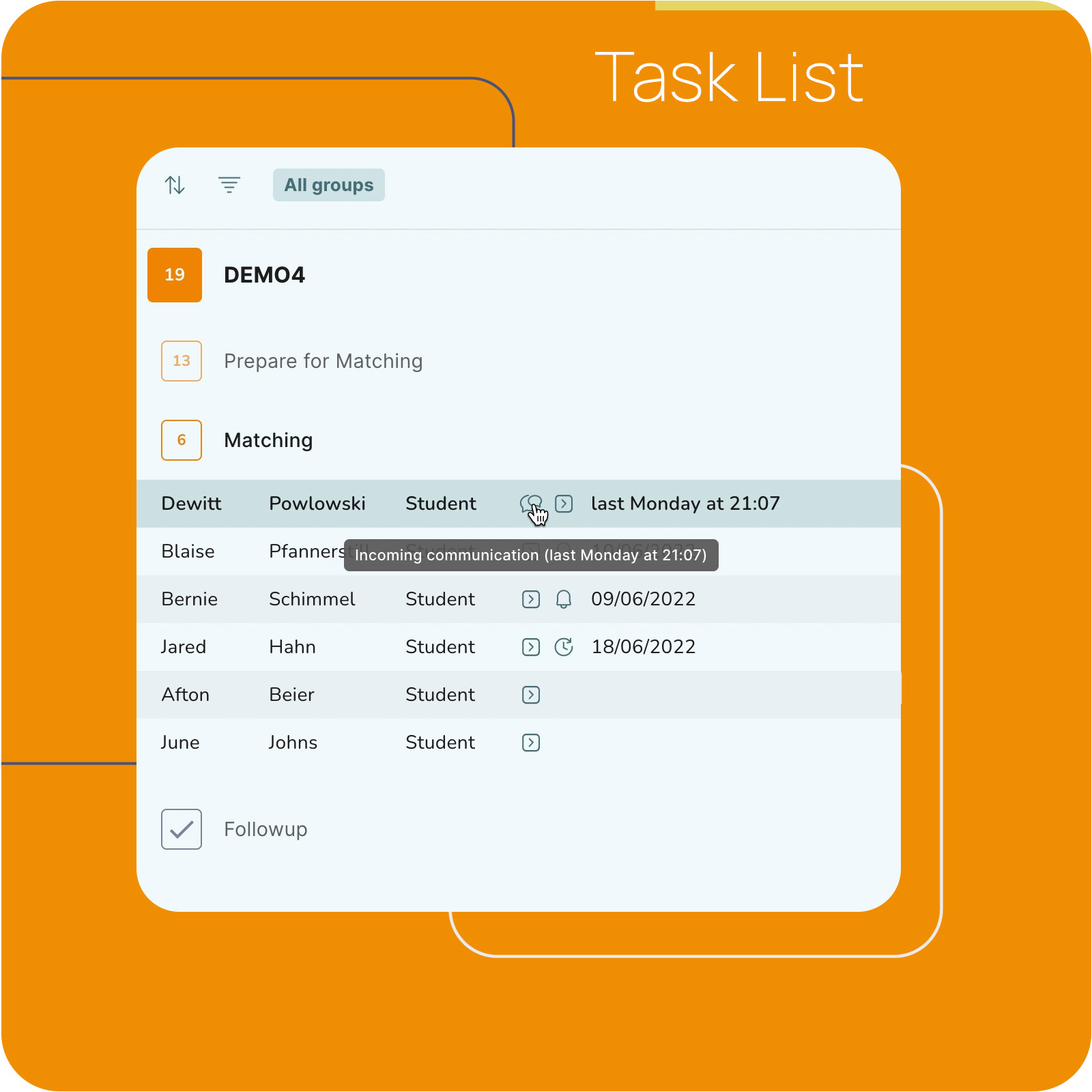
Let us introduce you to the ⚡️ TASK LIST
The TASK LIST is a core feature of Kople and supports your workflow by…

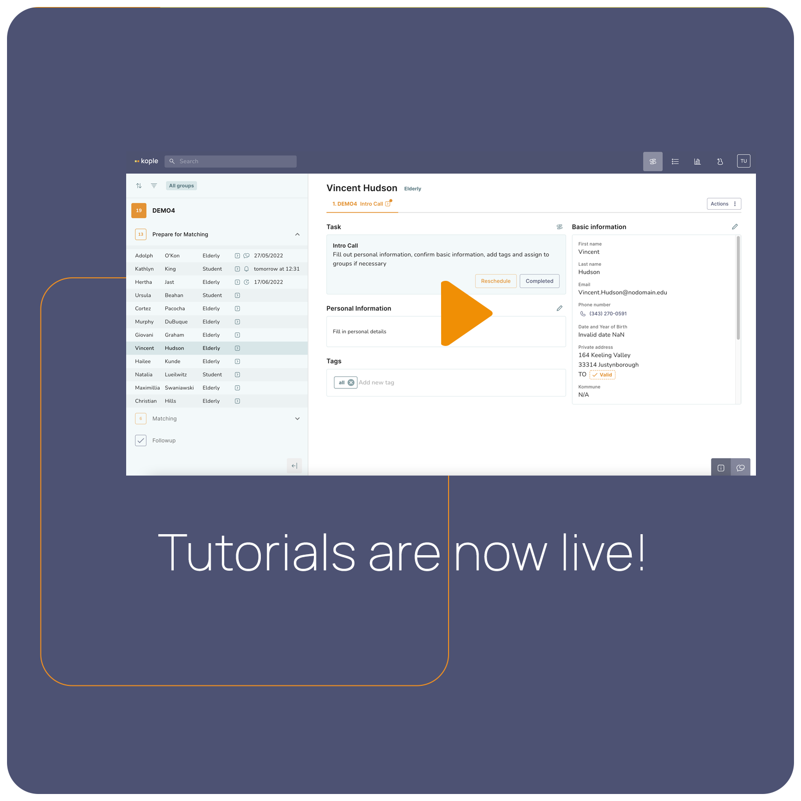
The screen recorded guides to the system are now live!
Visit our tutorial page to watch cofounder Andreas introduce the core concept and features of Kople.

Meet our new UX developer – Rasmus!
Nothing is more important than giving the customers the ideal experience with Kople. Rasmus is an experienced developer and he is here to make sure that matching and flow building will always feel easy when working with Kople…

Beta launch!
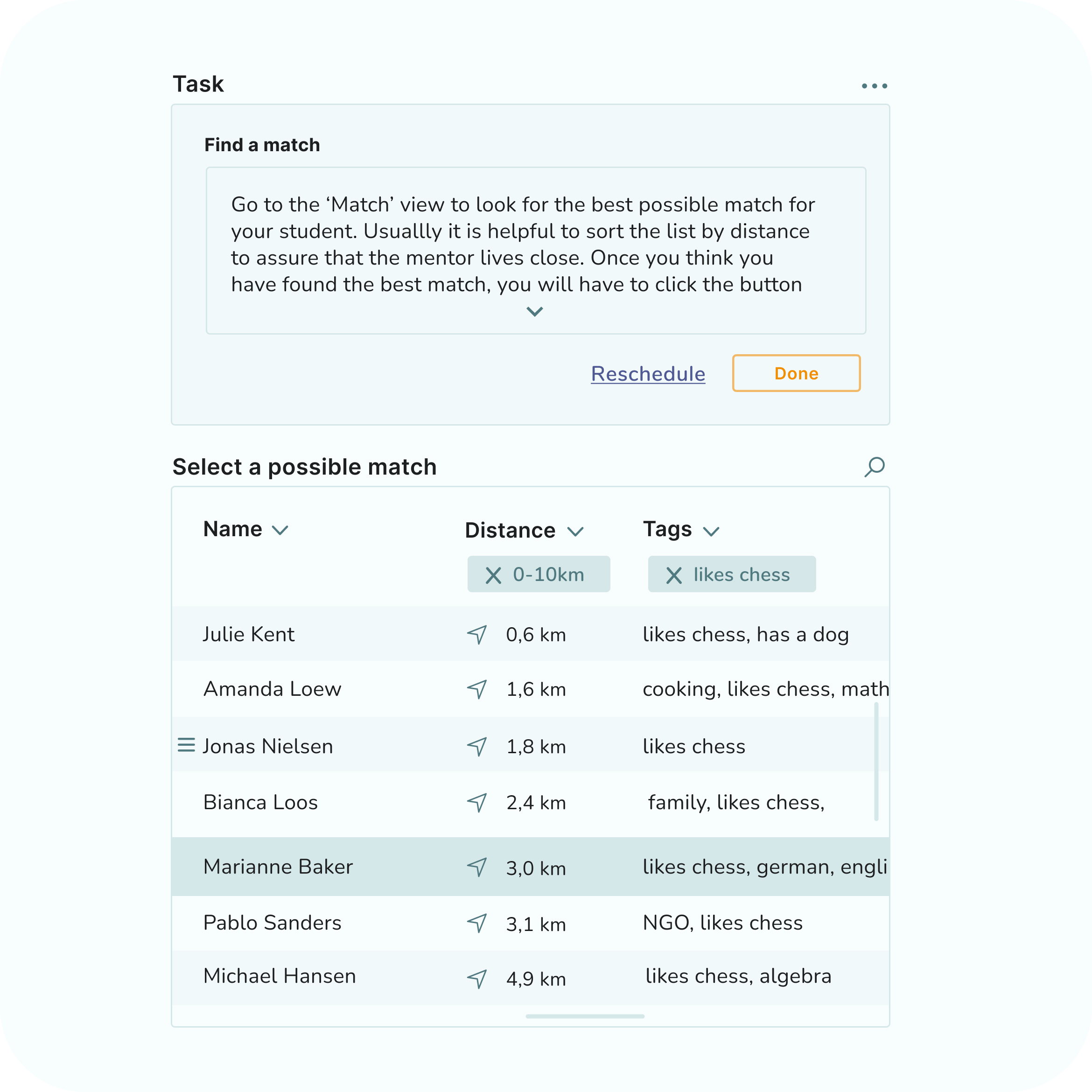
Koples customers have just started testing the system and we are happy to announce that matching, flow building and in-built communication is already part of Kople…