System walkthrough
Video Tutorials
Kople Tutorials
DOING A TASK
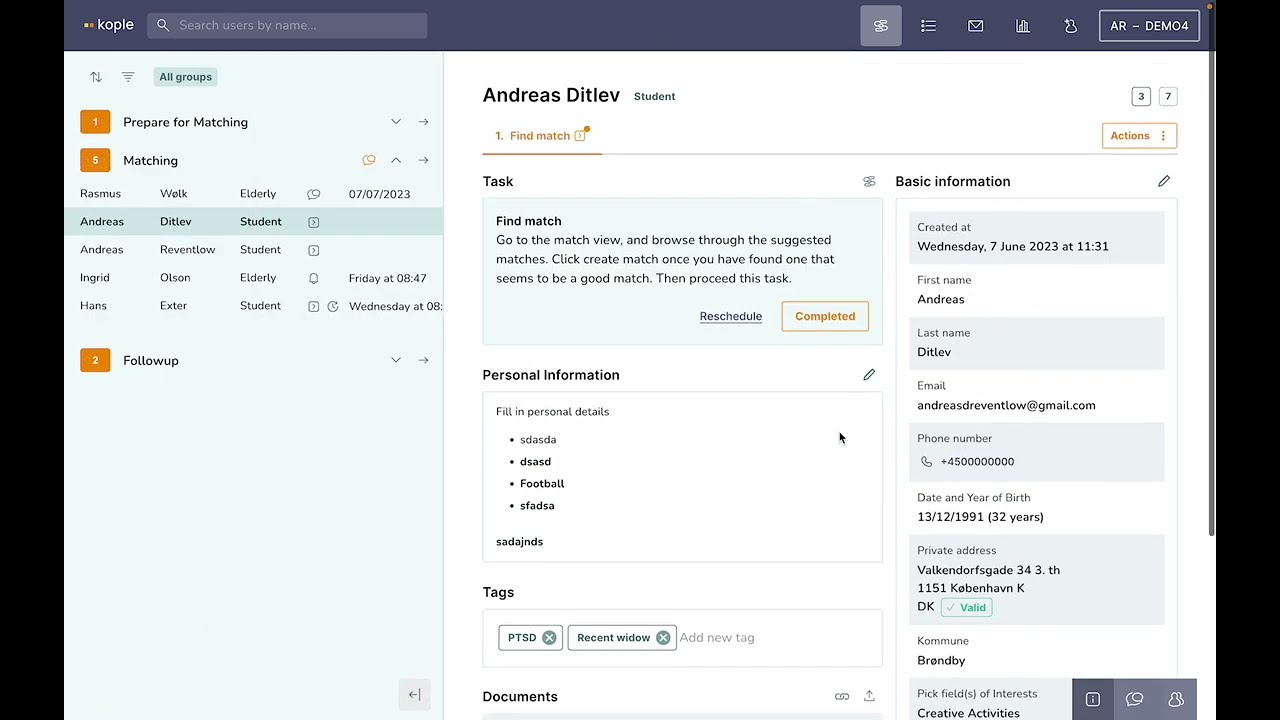
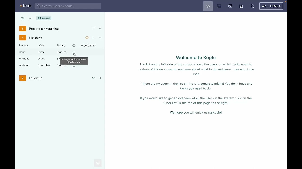
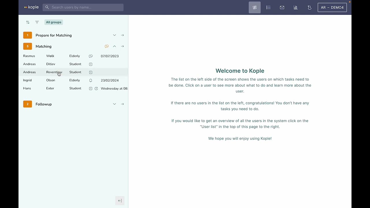
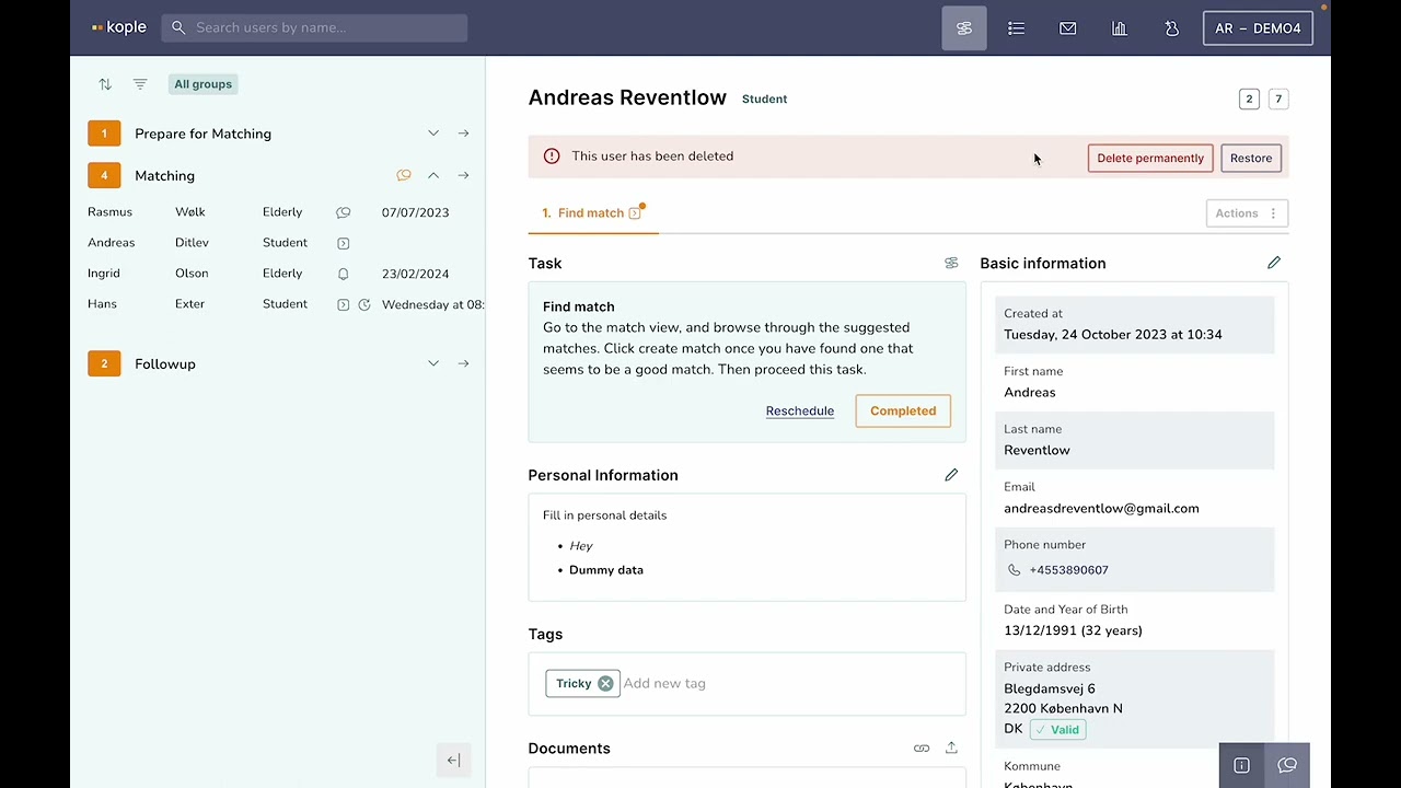
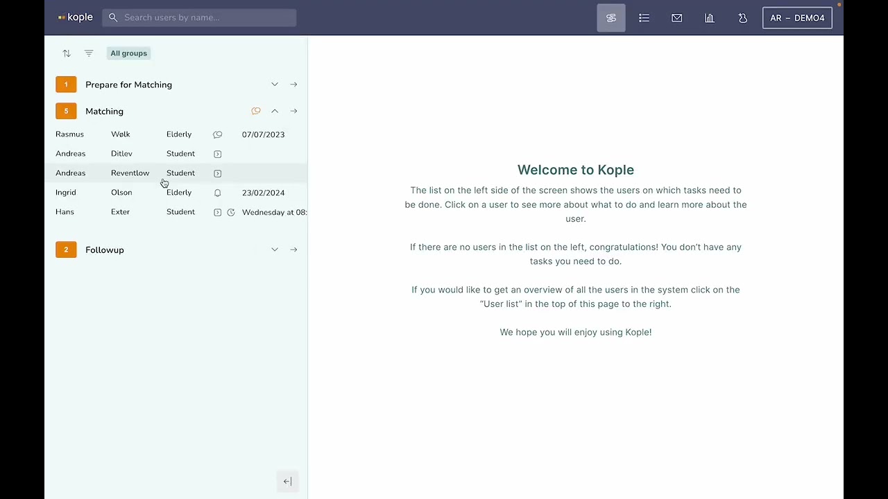
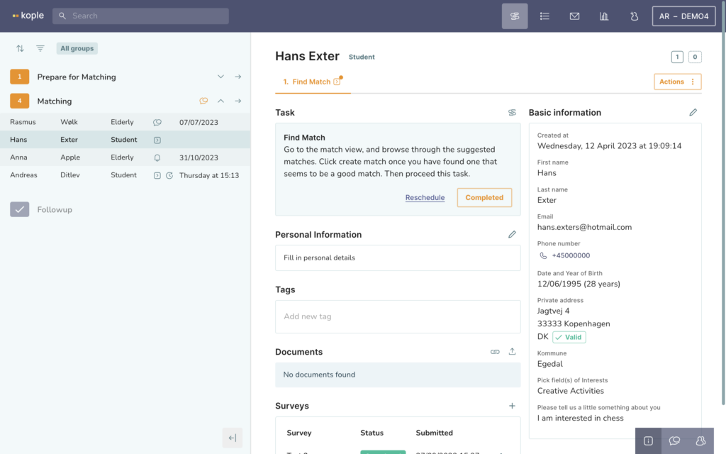
The task list on the left shows you what to do by listing relevant tasks, reminders and unanswered messages or calls. When you click on a user in the task list you can see their profile. If you right click on a user you can assign a color to them.
The task is described in the middle of the screen. You can either complete a task and move on in the flow or reschedule it to another day.
CREATING A SAVED LIST OF USERS
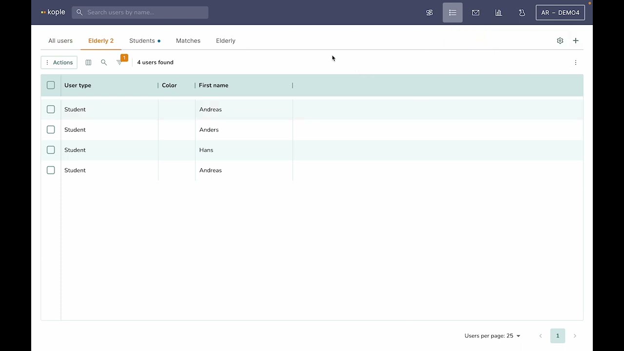
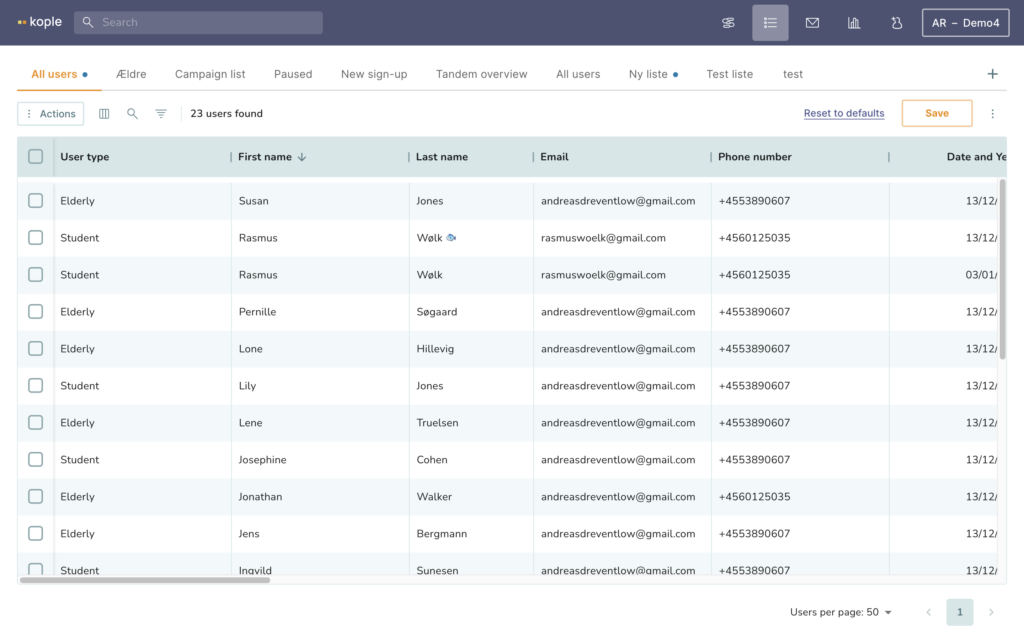
The user list shows you all your users. Through the icons above the list on the left side you can make many different filters, sort and choose what columns to see. On the plus in top right side you can create new list and save the setup of these lists.
Be aware that if you add multiple filters all of them will either use the “And” or the “Or” logic depending on your choice when adding the second filter.
If you click on a user their profile will show on top of the user list.
You can export data through the “Actions” button and search for data by clicking on the search icon on the left side above the list.
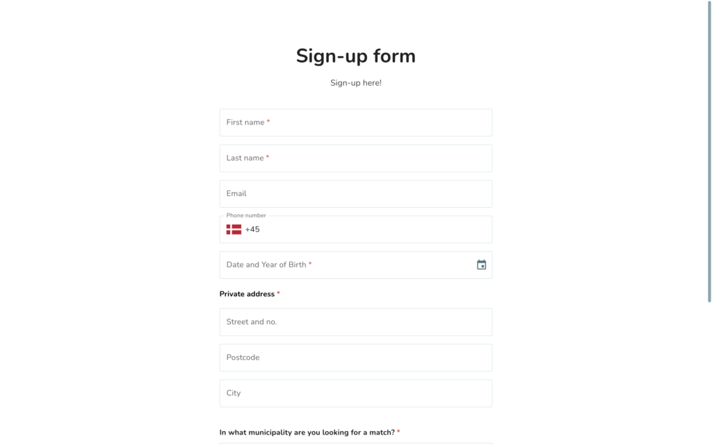
SIGNING UP A USER
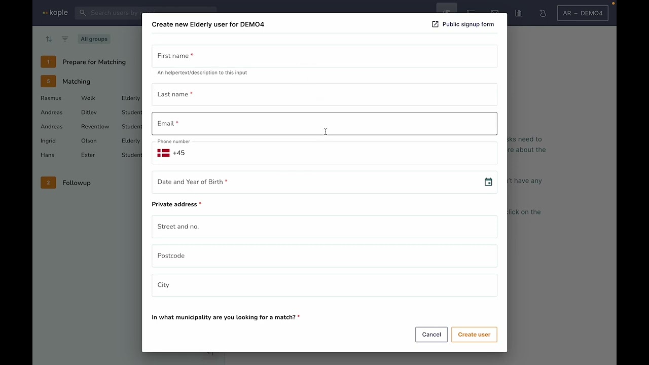
The sign-up form is the way through which users are entered into the system. You can customise it to contain the fields you need and then put it on your website for users to fill out themselves. It is also available directly in the system by clicking on the icon of a person in the top right corner.
When starting to use Kople a data upload of all existing users is an option.
SEEING INFORMATION ABOUT A USER
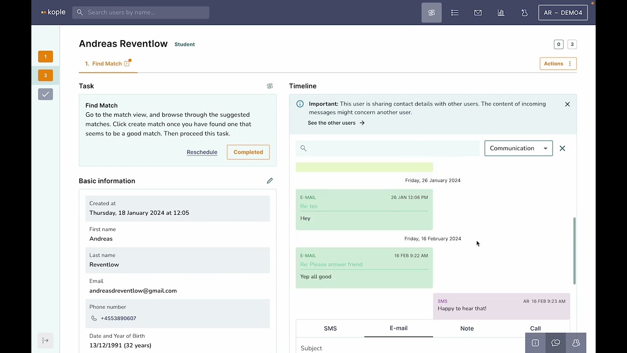
The user profile contains all the information related to a user. It has 3 tabs shown in grey in the bottom right corner – one for information overview, one for the communications timeline and one for matching.
If you feel the need more more space when looking at a user profile you can click the arrow button in the lower left corner of the profile to expand it.

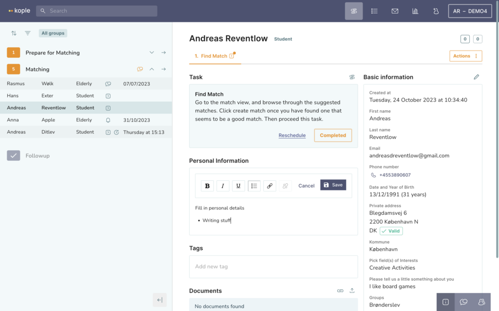
WRITING NOTES ABOUT A USER
The Personal Information field in the middle is a free text field allowing you to write about the user.
Tags are useful if you often write the same things about users. Rather than writing it in the personal information field you can add a tag. This allows you to filter for them in the user list, and see the tag easily when looking for a match for the user.
ADDING DOCUMENTS OR SURVEYS
The documents field allows you to upload documents to the user and shows all attached files received from the user. You can also generate a file upload link to send to a user.
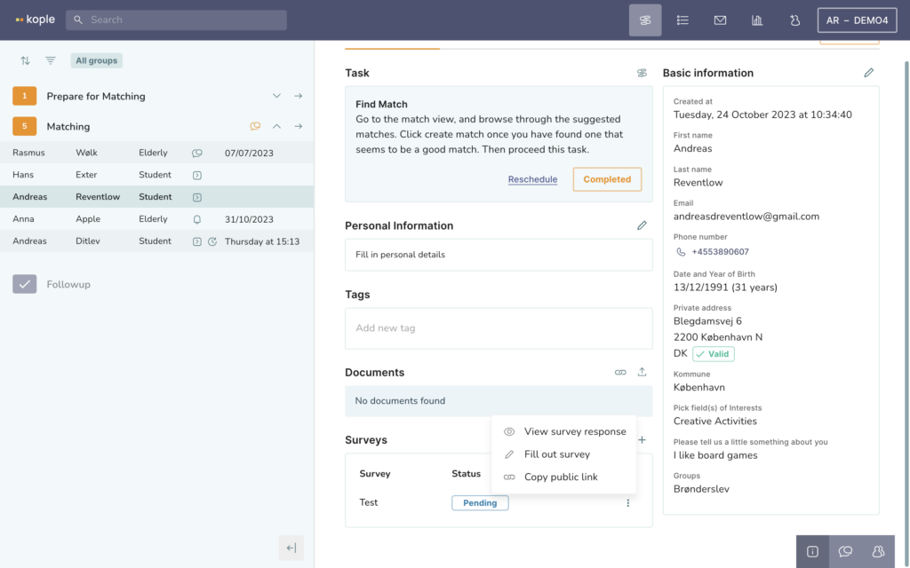
Surveys can also be built in Kople and can be sent to the users both automatically and manually or you can fill them out on their behalf.
For the last two options you first need to add the survey to the user by clicking on the plus icon.
Once the survey is added you can click on the 3 dots next to it for a menu of options.
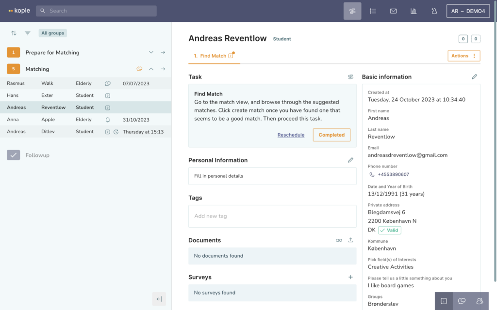
EDITING A USERS BASIC INFORMATION
The Basic Information on right side shows all the data from the sign-up. You can click on the pencil icon to edit the data.
Groups are also edited through the basic information. The main function of groups are to allow for filtering the task list by groups (by clicking the 3 lines above the task list) and to give limited access to certain colleagues so they can only see the users in groups that are relevant to them. Groups need to be predefined in the project settings.
COMMUNICATING
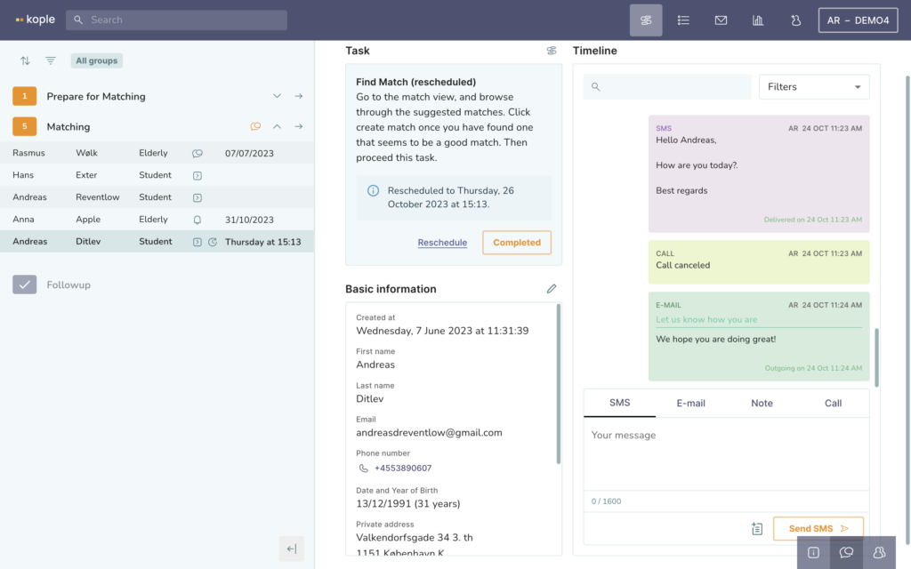
The timeline shows you what happened to a user. If you have integrated email and phone it shows you all calls, SMS and email in and out of the system and you can make/send calls, SMS, emails and notes. In the top right corner of the timeline you can filter what you want to see.
Here are the links to the different statuses of SMS and emails.
Be aware that the timeline does not show forwarded content and earlier emails in a thread. These are shown above in the timeline, not on the message itself.
Manual templates are useful if you often write the same email, note or SMS They autofill things like name and more. To see your templates click on the button just left of the orange send button in the bottom right corner.
Reminders can be created by right clicking on an element in the timeline. Once you have chosen the due date for the reminder the user will show up in the task list with a bell icon and the date you chose.
MATCHING
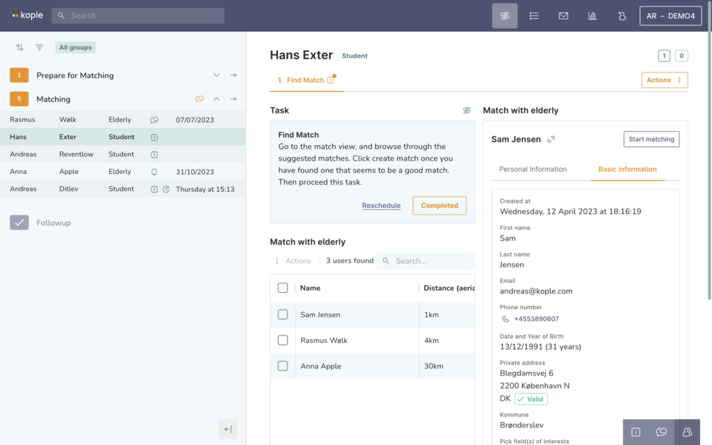
The match tab is shown in the bottom right corner with an icon of two people when a user is in matchable state.
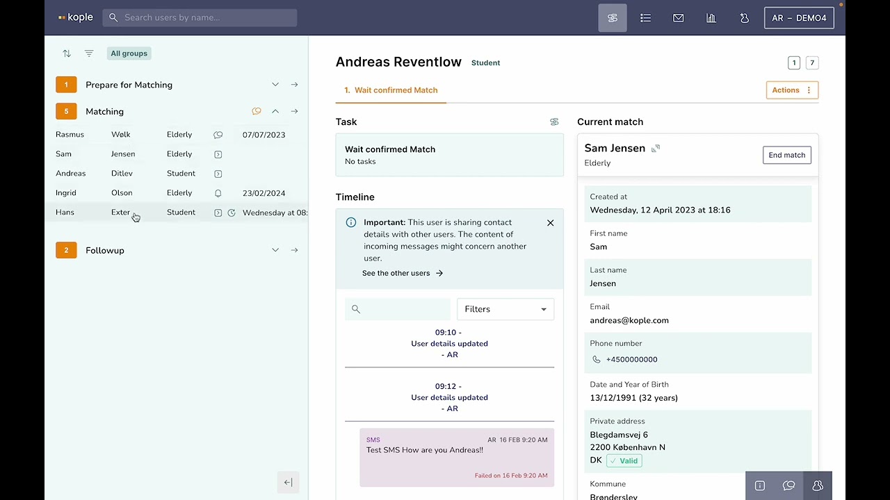
Here you can see a list of potential matches sorted by distance to the user. You can look at the Personal Information and Basic Information of the potential matches by clicking on their name. You start a match by clicking “Start matching” and the button then changes to “End match”. For now you have just created a temporary match to contact the users and see if it should become an actual match.
REMATCHING
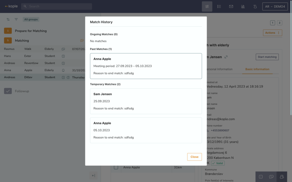
The match history is relevant to check out before rematching a user. It can be accessed from the top right corner of the user profile where you can see two small numbers indicating how many matches the user has had.
When you click on the numbers you see how long the matches lasted and if they were actual matches or just temporary ones.
Multiple matches for one user can be done by creating a new flow through the action button in the top right corner of the user profile. Once created you see the extra flow just below the name of the user and can delete it by right clicking it. The new flow starts on the matchable state and either allows you to go the match tab and find a new match or makes the user show up in the match tab of the opposite user type so they can be matched.
DELETING OR PAUSING USERS
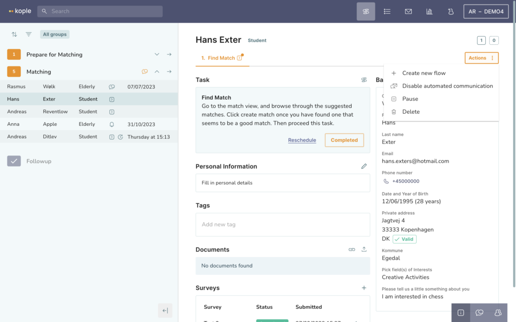
The action button in the top right corner of the user profile contains multiple features.
Pause automatic communication or pause the user. This hides the user from the task list and stops all automatic communication to the user.
Delete only marks the user for deletion at first, but after a set amount of months or when you click “Delete permanently” all personal data is deleted but statistical data is kept and is accessible through the dashboard.
COMMUNICATING WITH NON-USERS
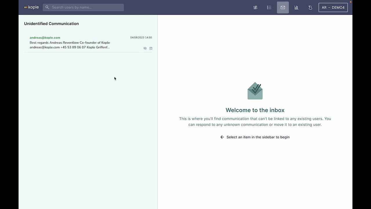
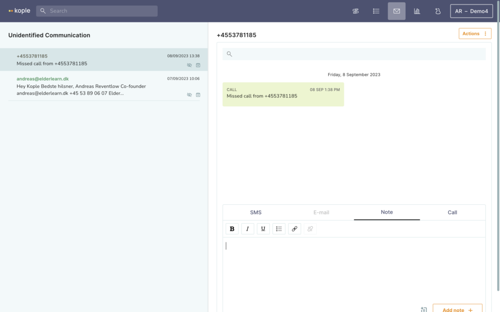
The inbox is where we show any calls, emails or SMS that have come in from numbers or emails that are not associated with a user.
REPORTING ON YOUR WORK
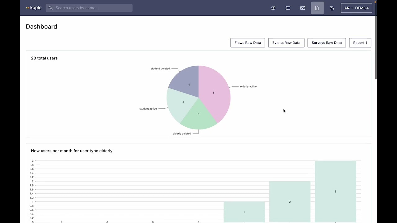
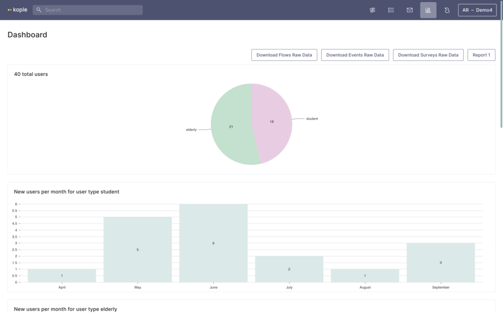
The dashboard shows you some basic statistics about your users. You are also able to download raw data and reports that show you detailed anonymised information about current or past users and matches. The reports can be filtered by time, tags and groups.
Project settings walkthrough
Video Tutorials
Kople Tutorials
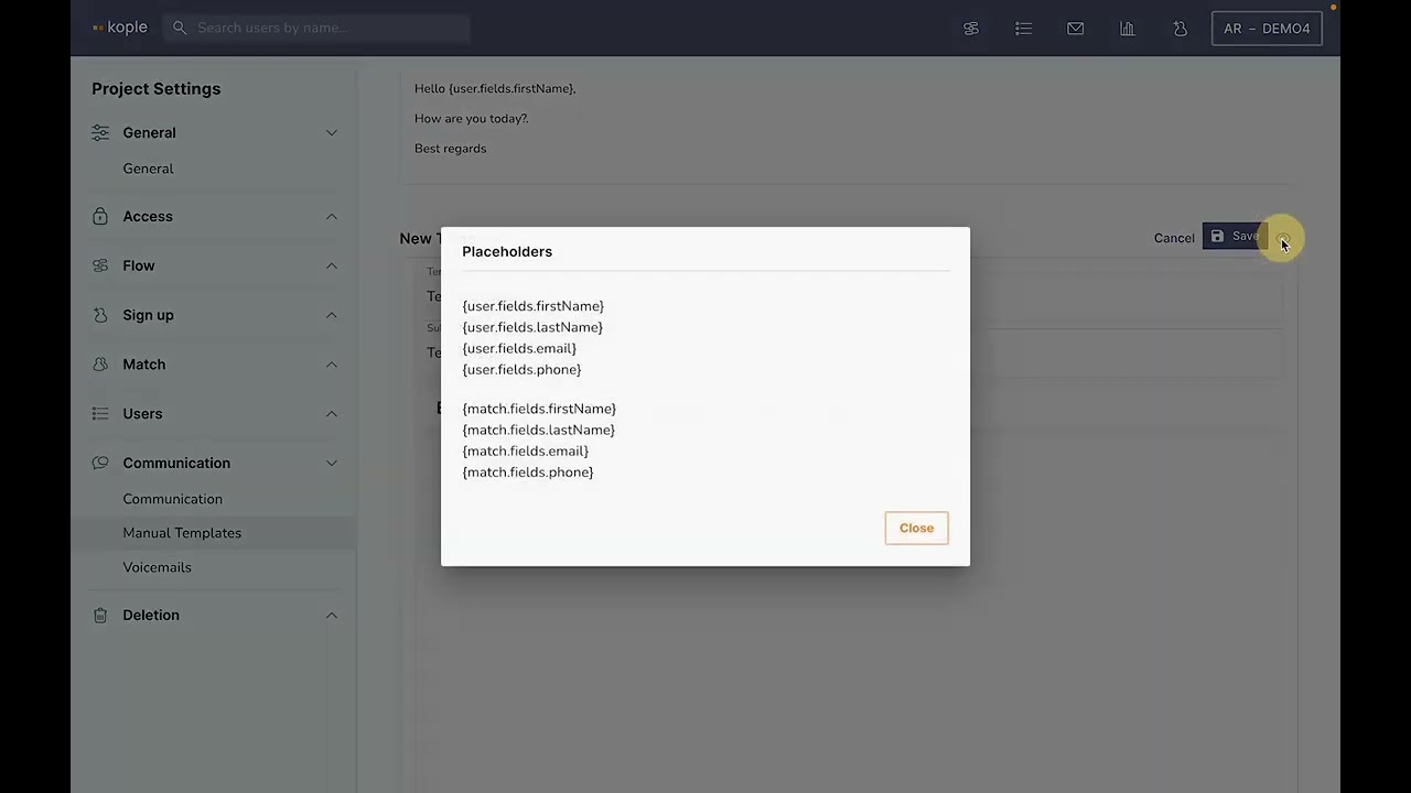
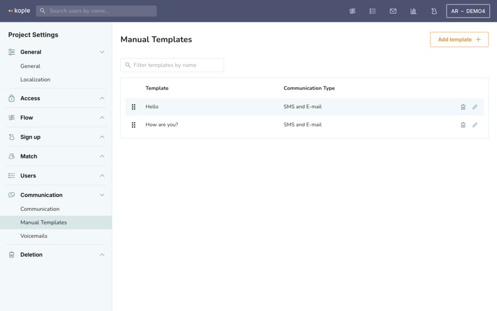
Manual templates can be set up under the “Communications” menu. You can decide on a template name, subject and content including autofilled elements like name and contact info. If you click on the pencil icon to edit a template you can click on “Browse placeholders” to see the available autofilled elements that you can put into the template.
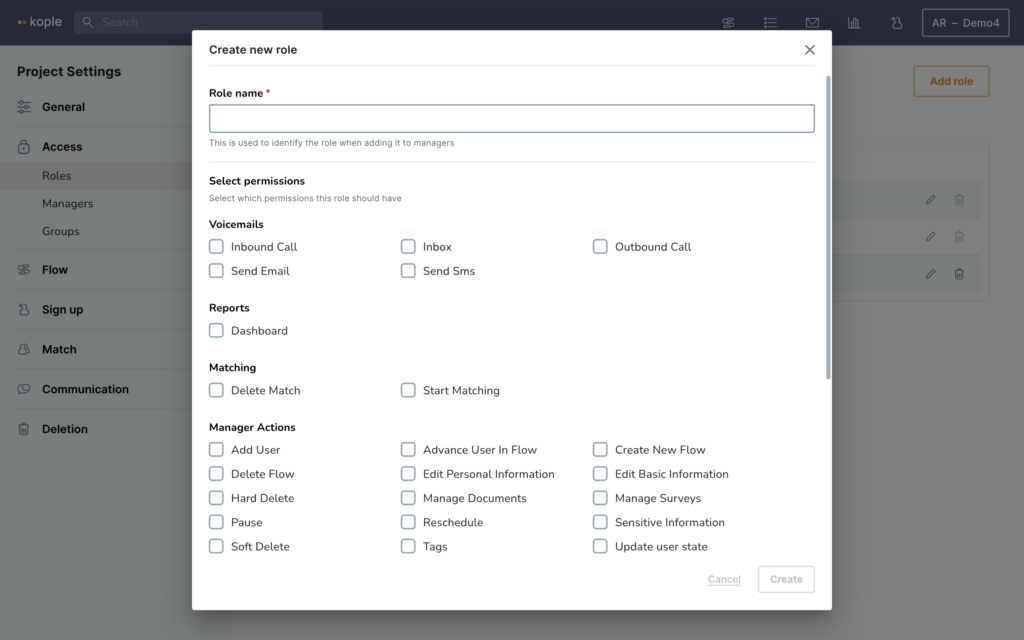
Roles can be used to give a limited access to Kople to certain colleagues. Kople has two default roles “Administrator” (access to project settings) and “Manager” (access to anything but project settings).
In the roles tab under the Access menu you can also create more specific roles.
Managers are created by clicking “Add manager” in the top right corner. This way you can give access to Kople to a colleague and choose their credentials including what groups and what parts of the system they have access to.
This is done under “Managers” in the “Access menu where you can also delete and edit existing managers.
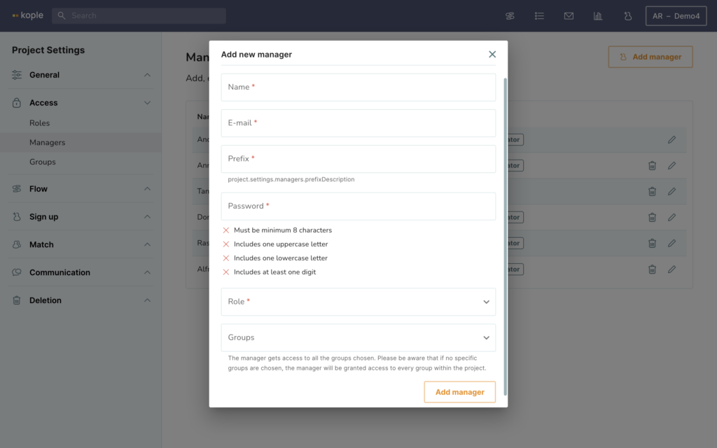
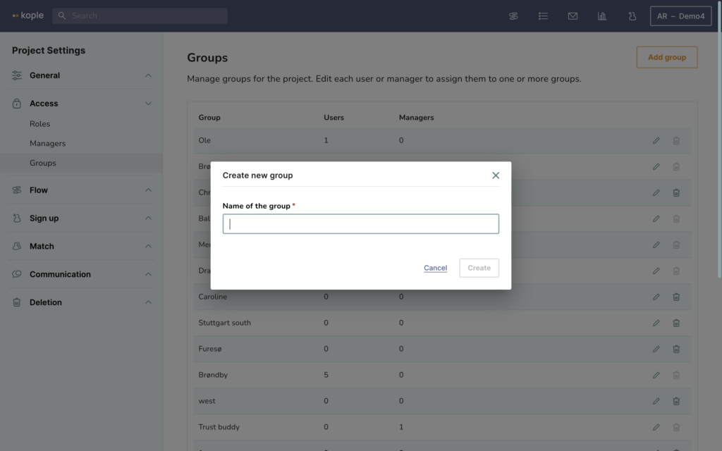
Groups can be used to divide work between colleagues. Once a group is created through the “Access” menu under “Groups” a user can be added to that group manually or automatically based on a sign-up field. Your colleagues can then choose what groups to see in the task list or user list or they can be given a limited access to only see users in the groups which are relevant for them.
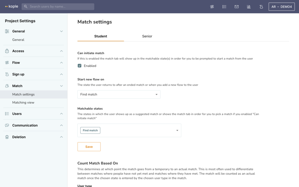
Match settings in the “Match” menu allows you to choose if the user type can initiate a match, in what states they can be matched and what state they go to when you end a match or add an extra flow.
You can also choose what state on what user type makes the match go from being a temporary to an actual match that counts in the statistics.
You can also add “End match reasons” for each user type which you will then have to choose from whenever you end a match.
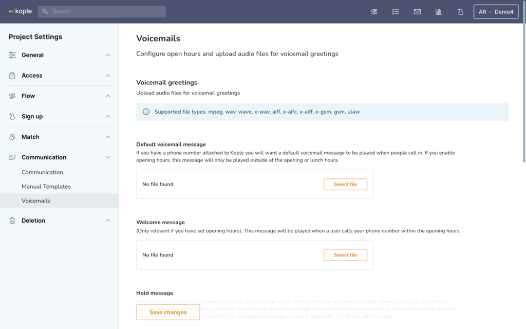
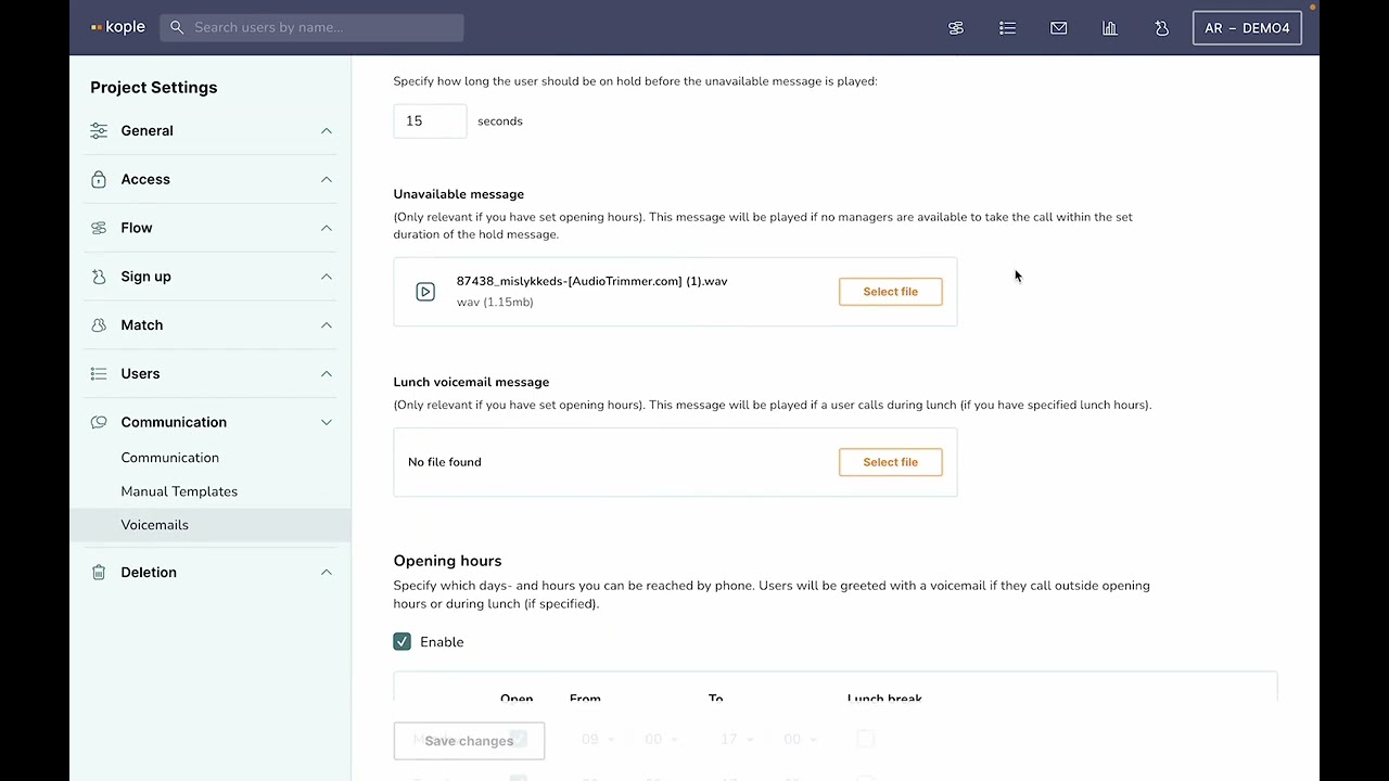
Voicemails under the “Communications” menu can be set up if you have integrated phone. At the bottom of the page you can enable and choose opening hours. Without opening hours you just need a default message – with opening hours all of the messages should preferably be uploaded.
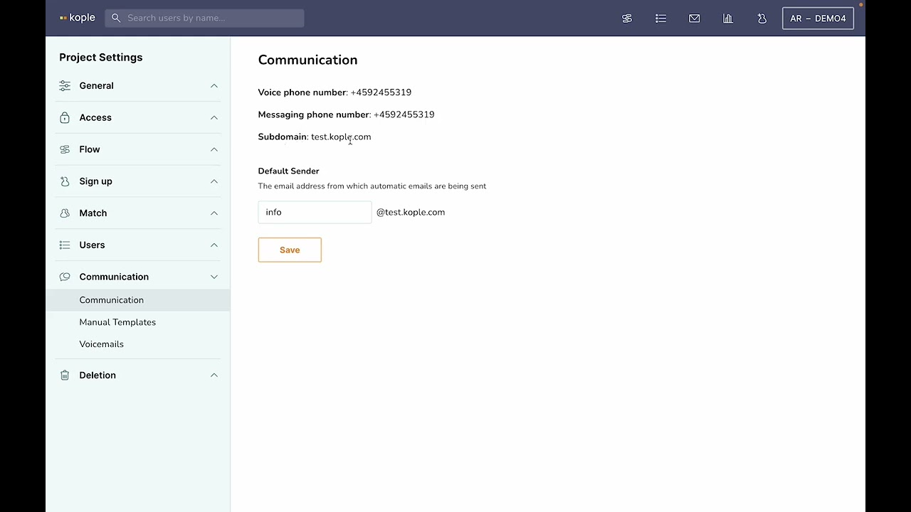
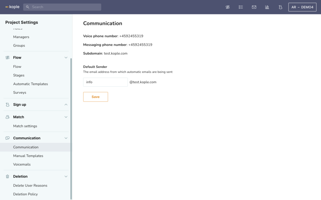
Communication shows you what phone number is used for calls and messaging and what your subdomain email is. This is the email you will be sending from and receiving to. It does not matter what comes before the @ when receiving emails as all inbound communication is shown on the relevant user or in the inbox if there is no user associated.
When writing manual outbound emails the chosen prefix will be shown before the @ and in this menu you can choose what is shown before the @ for automatically sent emails.
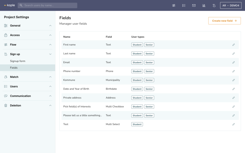
The fields builder allows you to create and delete basic information fields. These will always be shown on the associated usertypes basic information, but only shown on the signup form of the usertype once added in the signup form builder.
There are many different field types depending on what you need. If you want to use inbuilt communication it is important that you use the email and phone fields rather than text and the same goes for the address field if you want to calculate distances between users.
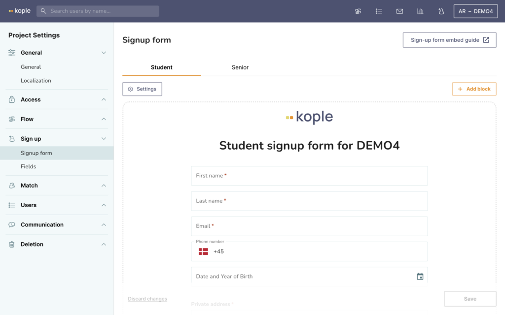
The signup form builder is where you add fields to a usertypes sign-up form. You do this by clicking add block, or by hovering an existing block and clicking the plus icon.
Then you pick a header, spacer or a field that has not been added to this sign-up form yet. When you add fields you will often need to hover and click to pencil icon to add labels and options to fully finalise their look in the signup form.
Remember to always click save on the form in the bottom right corner, not just after editing a block.
In the settings you can change more generalised elements like languages available. You need to add languages in the Localization tab first though.
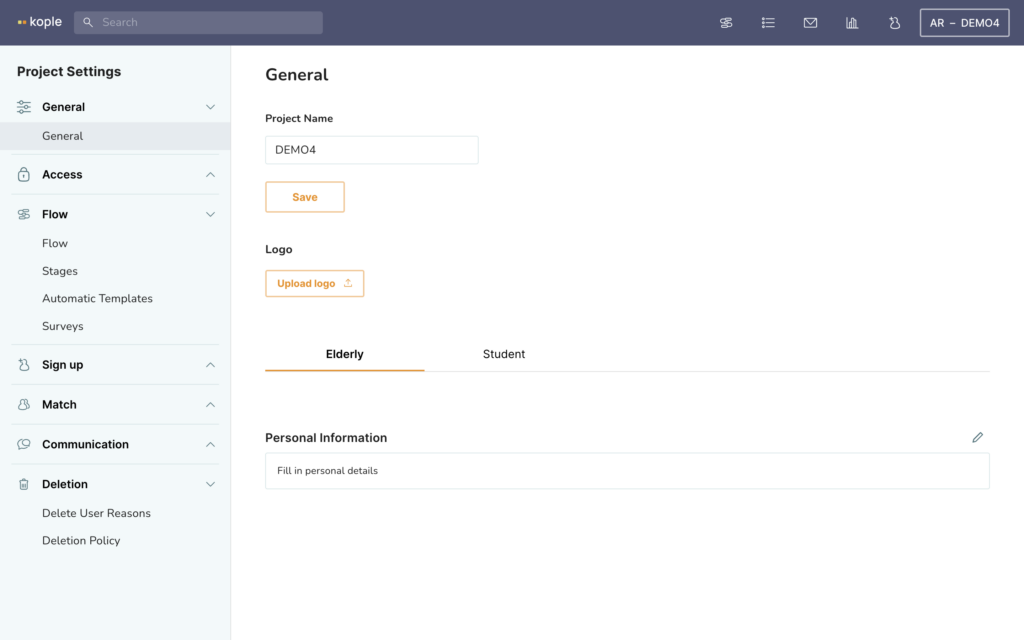
General settings are for choosing the project name and logo.
Here you can also change what should be written by default in the personal information field. This is helpful if you want certain questions to be prewritten so they always get asked.
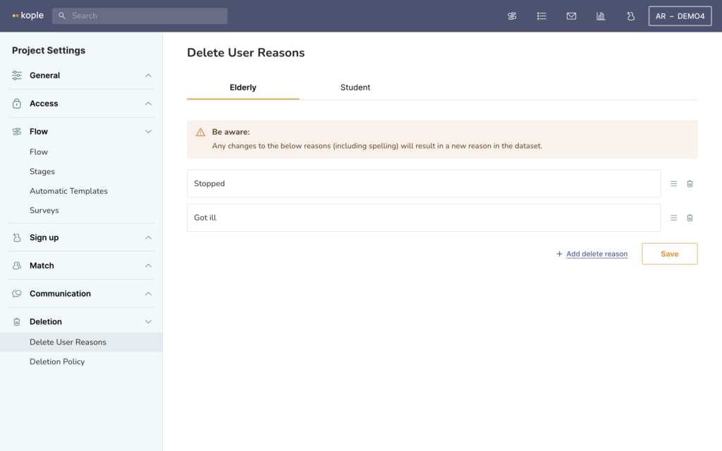
Delete user reasons are useful if you want to have data about why people stop. You can set them up for each user type, but be aware that any change in spelling will create a new delete reason in the dataset.
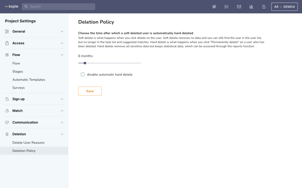
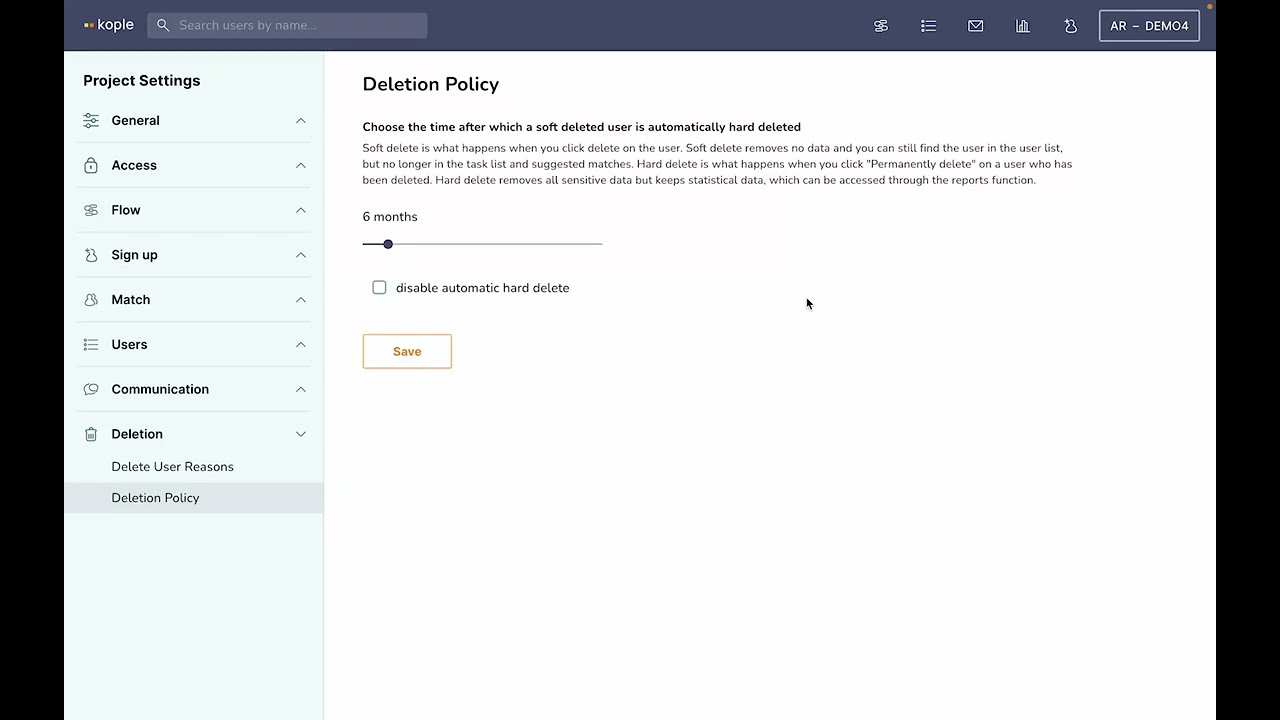
The Deletion Policy is the amount of months from you delete a user to all the personal data of that user being deleted. You can also delete all personal data on a user manually after deleting them.
The statistical data will still be available, but it is important to delete personal data when you are not using it any more to respect data privacy.
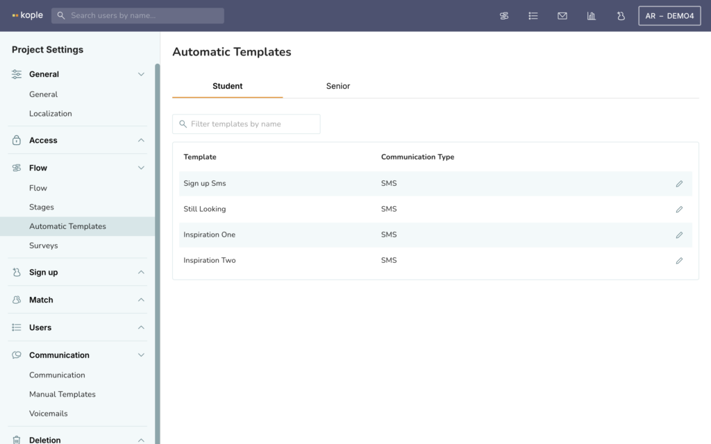
The Automatic Templates allows you to configure what emails and SMSs are sent out automatically. You can edit them by clicking on the pencil icon and autofill name and contact info of the user and the match by using the codes that you can see by clicking on “Browse placeholders” when the editor is open.
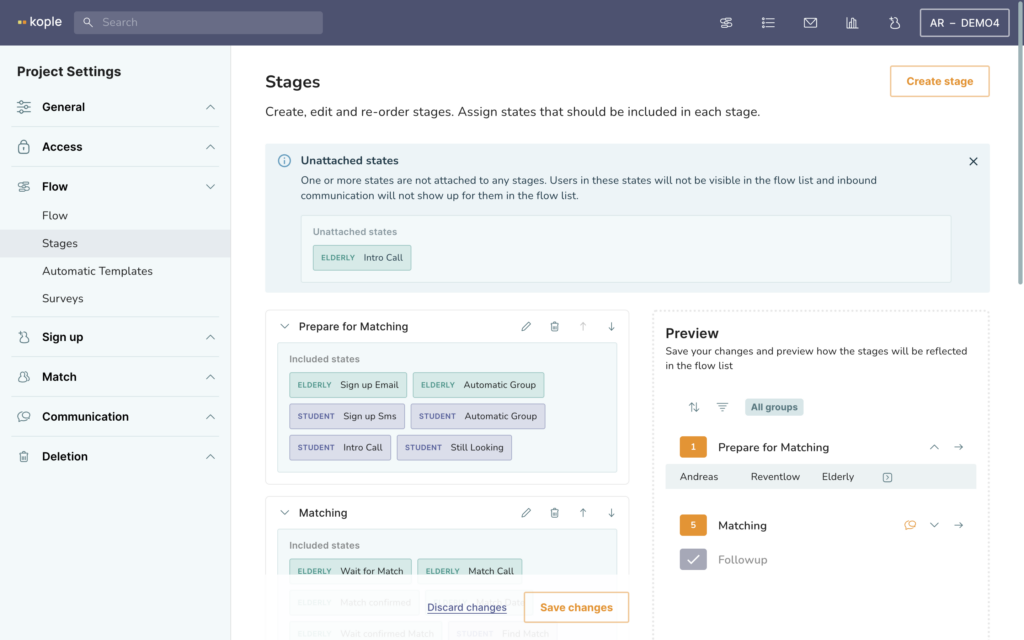
Stages are what defines where a certain state in the flow is shown in the task list. It is very important that all states are added to a stage because otherwise you might not see tasks or inbound communication. If there are unattached states you will se a warning in top.
To attach a state to a stage you click on the pencil icon to edit the stage. Then you get a menu where you can see all states, first for one user type, then for the other. You can also choose only to see states that are not attached to a stage.
You can also add a new stage by clicking on the “Create stage” button in the top right corner and move it so that the states are in the right order by clicking on the arrows next to the pencil and delete icons.
To the right you have a preview option if your screen is sufficiently big or zoomed out enough.
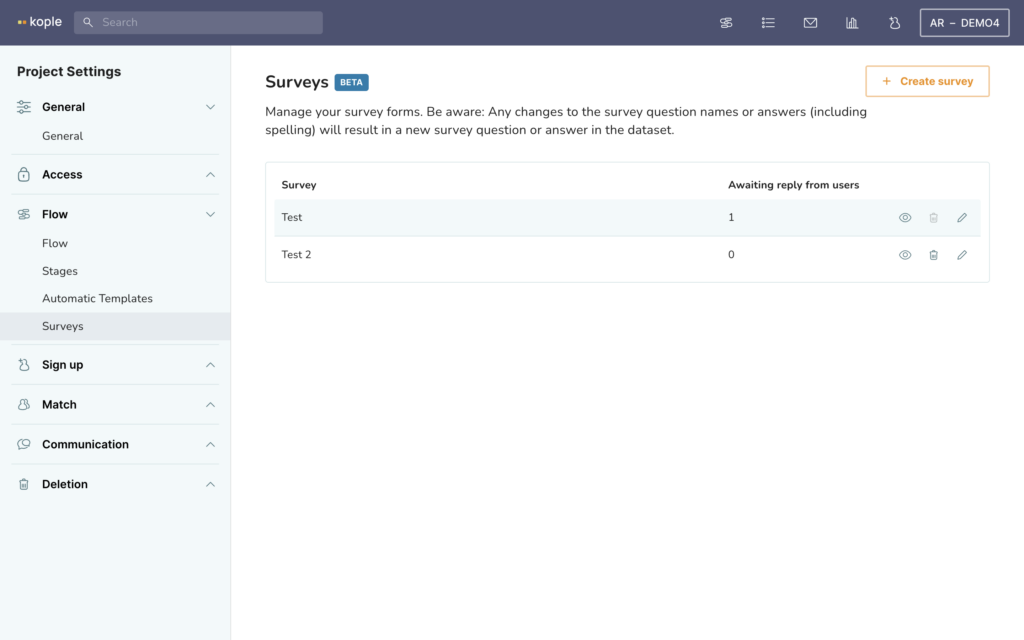
Surveys allows you to create surveys that can either be sent to the user automatically or manually or be filled out on behalf of the user through the system. You create a survey by clicking on the “Create survey” button in the top right corner. Once this is done you can edit, delete or preview the survey from this menu.
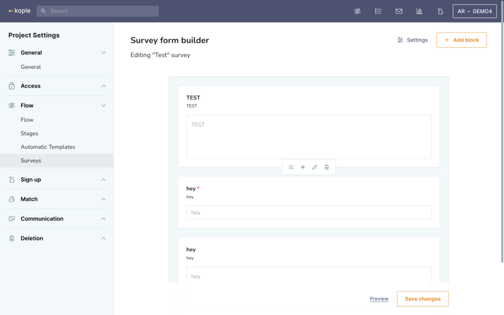
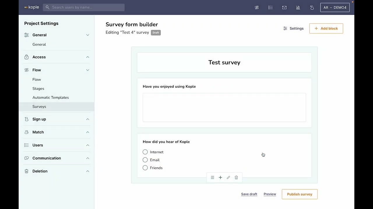
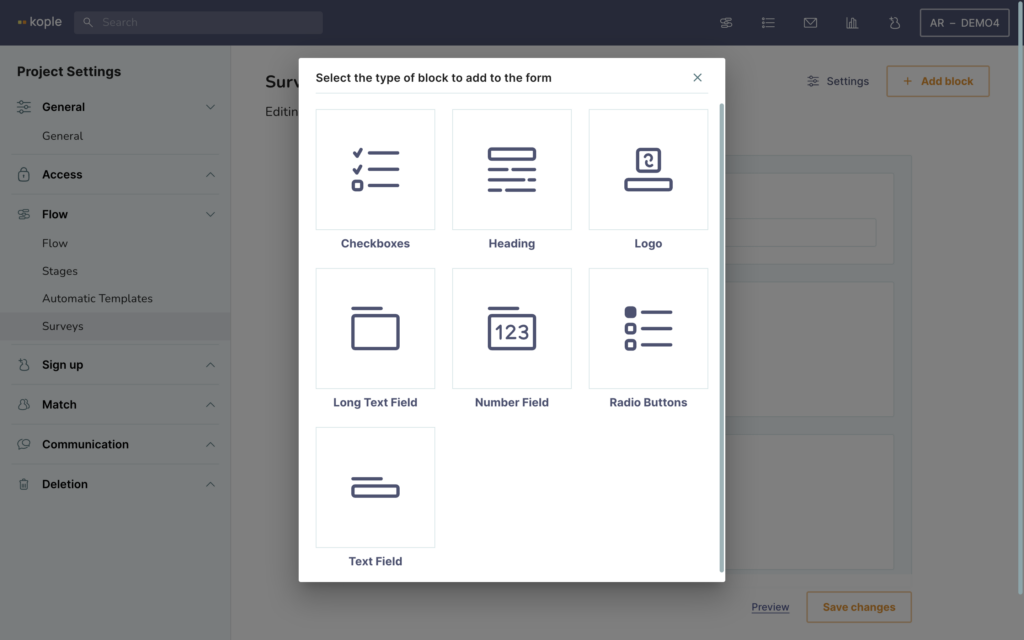
The survey form builder is the view that opens when you click on the pencil icon to edit a survey. If you have not any questions yet it will the “Add block” button will be in the middle of the screen, otherwise it will in the top right corner. You can also add a block by clicking on the + that shows when you hover over an existing question. This menu, shown in the middle of the screenshot also allows you to delete a question, edit it or move it by clicking on the three lines to the left.
Survey questions/blocks gives you 7 options. You can add a checkbox question, a heading for the survey, a logo, a long text field, a number field, a radio button field or a text field.
Playing around with this is the right way to learn. The main difference to be aware of is that a checkbox can have multiple answers chosen and a radio button only one.
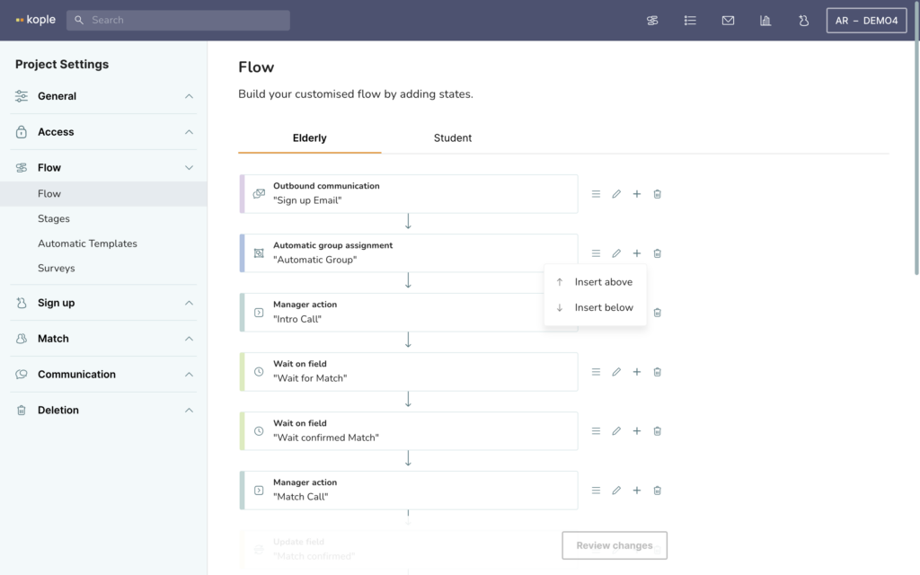
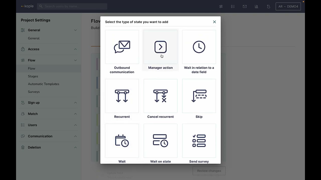
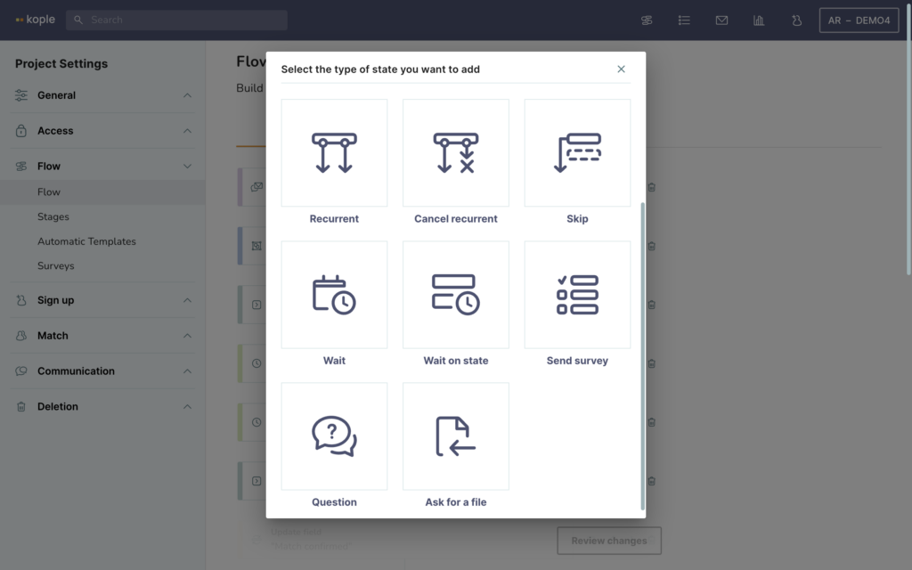
The flow builder allows you to build or change the flow. Each user type has their own flow. You can add a state to the flow by clicking on the plus icon next to any state. You can also move states by clicking on the three lines next to it, edit states by clicking on the pencil icon or delete states by clicking on the trash can icon.
Once you click review changes and then save them the changes will take immidiate effect for all users. Always be careful when changing the flow
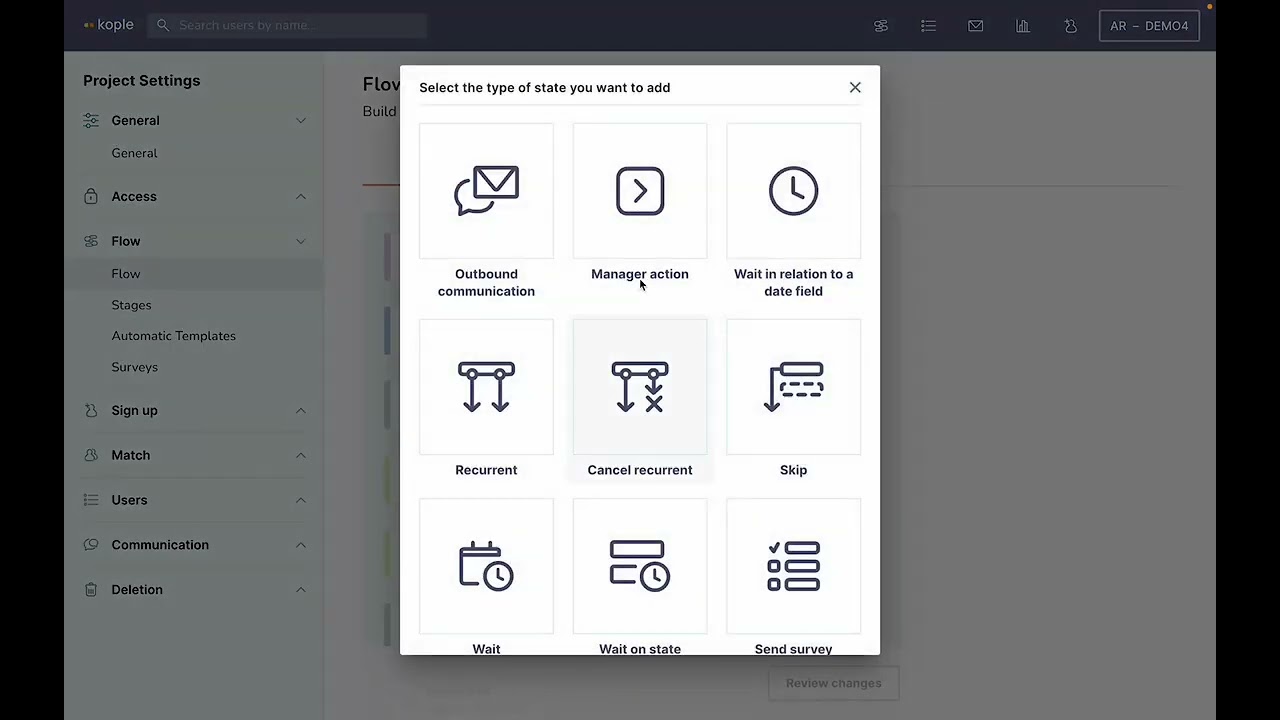
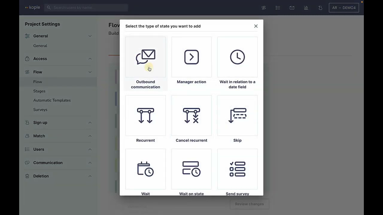
The states you can add take the following forms:
1. Outbound communication (automatic SMS or email)
2. Manager action (task in the task list)
3. Wait (for x amount of time)
4. Wait on state (wait for x amount of time from entering another state – can be used to connect with the flow of the users match)
5. Recurrent (automatic email or SMS that repeats independently of the flow)
6. Send survey (Automatically send one of the surveys you have built)
7. Question (Ask a yes or no question fx “Did you meet this month?”)
8. Ask for file (request a file upload)
9. Skip (Move to state depending on answer of survey, question or ask for file)
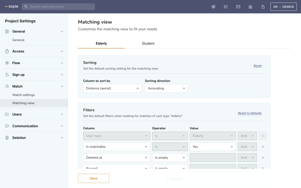
The matching view editor enables you to choose what you see in the matching view.
You can choose the following:
– What to sort by
– What default filters to have on for the list of suggested matches
– What columns to see in that list – What fields to see when the users in the list are expanded to be shown in the “card view” – What fields to see of the user you are looking for a match from
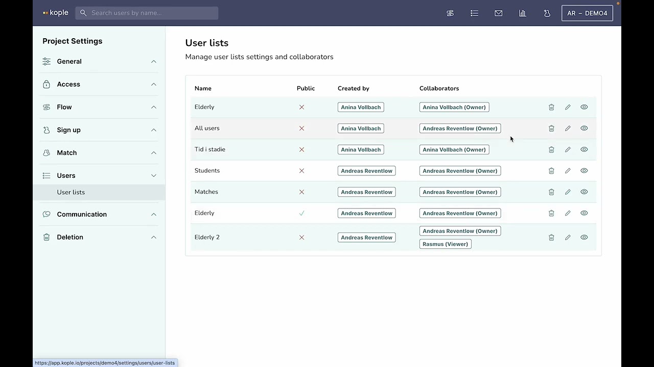
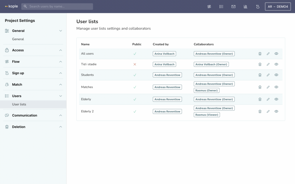
The user lists editor in the project settings allows you to choose who has access to what lists. Generally you will be able to change this from the normal user list as well, but the editor in project settings can come in handy if you fx need to transfer ownership of a list from a manager who no longer works with youu
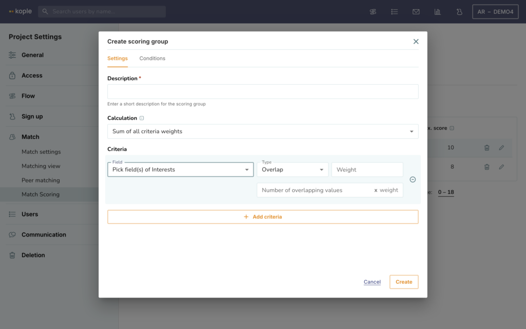
Match score can be used if you want to sort potential matches by overlap in answers in the sign-up instead of distance.
You can set up scoring groups and choose what criteria and gives a certain score. There are many options so we recommend playing around with the weights a bit.
Once a score is set up, make sure to go to the matching view editor and put match score on as a column in the match list. Also consider if you want to toggle on sorting by the match score when there.
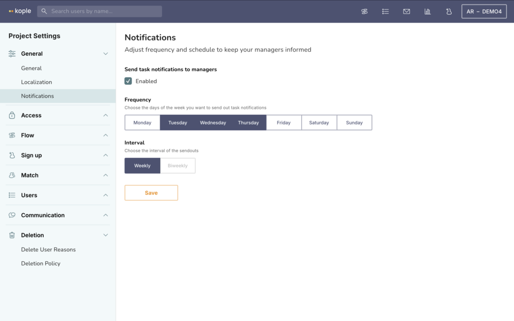
Notifications allows you to choose if and how often you want all managers in Kople to receive an email about their tasks. If they only have access to a certain group/groups they will only see the tasks of those groups. If they have access to all groups they will see all tasks.
